Today, we announce our brand refresh.
It’s not a drastic departure from our old look. But we wanted a face lift to our brand identity to reflect the company we’re becoming as we grow and expand our operations.
In this post, we also wanted to explain the meaning of our rebrand.
Overall, we were happy with our old logo:
It was simple and we like to think elegant. The three diamonds were an abstract symbolism of the sun, a daystar, the inspiration behind our company name. Just as the rising sun signifies a new day, the rising adoption of solar represents a turning point for sub-Saharan Africa’s energy needs.
Solar power is clean, affordable, and reliable. Solar energy prices are plummeting at an unprecedented pace. African businesses, which relied on polluting diesel generators or finicky and expensive grid power, no longer have to choose between necessary energy and sustainability.
By using a clean trio of diamonds, we wanted a logo that stood out from suns or stars, the typical emblems of renewable energy companies.
Our impulse to be different was also reflected in our brand color palette. Instead of the normal green or yellow, we used shades of blues for our official colors. We also incorporated images of the solar system into our brand materials. Given the expanse of space, we liked how these images were a metaphor of the limitless possibility of solar energy.
While our logo and color palette were practical - it lent itself easily to everything from decks to client reports to letterheads - they were also flat and lifeless. Our old look and feel lacked dynamism. As a team of ex management consultants and engineers, design wasn’t our forte.
We were keen to keep the clean look of our logo but give it more oomph.
Working with the brand expert Victoria Crandall at No Filter PR and the design team of Dunbar Creative, we went with a bolder direction:
For our new logo, we retained the simple shape but added more depth. The corner of the top diamond glimmers with the sun’s reflection. This tiny detail is not only another visual cue to ehem, we’re a solar energy company, it gives the emblem depth.
We were even more daring with our colors:
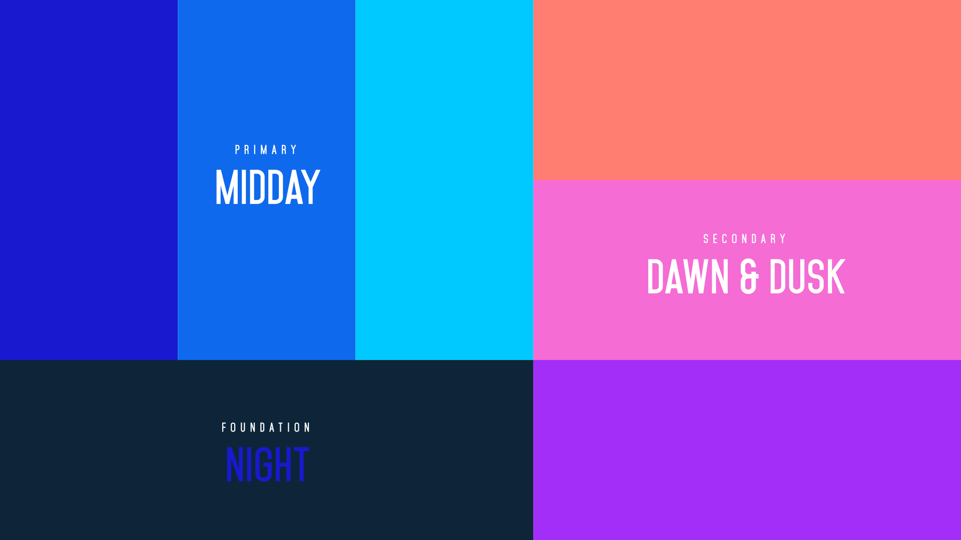
We kept the blue palette but chose more vibrant colors that were reminiscent of a clear blue sky on a sunny day.
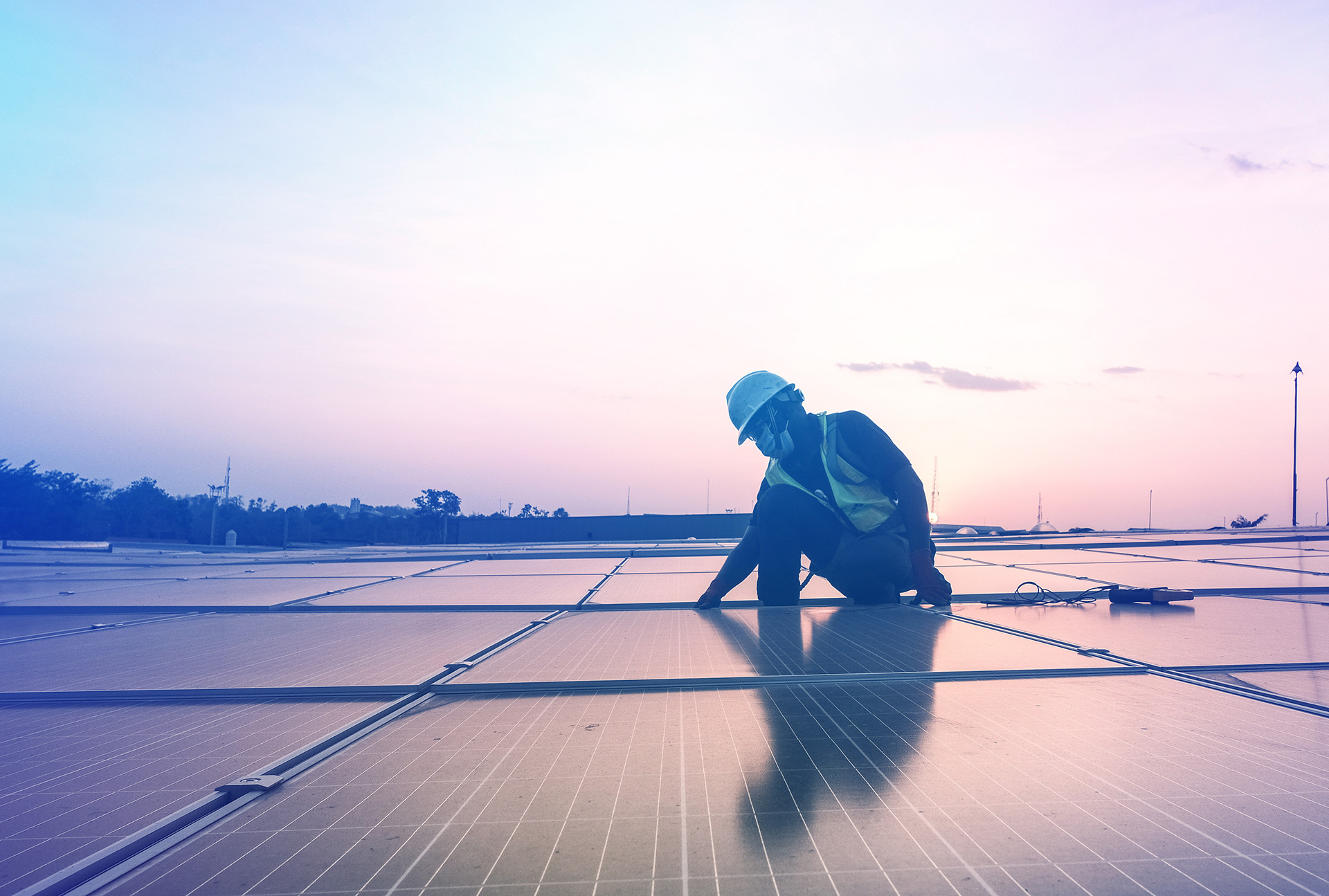
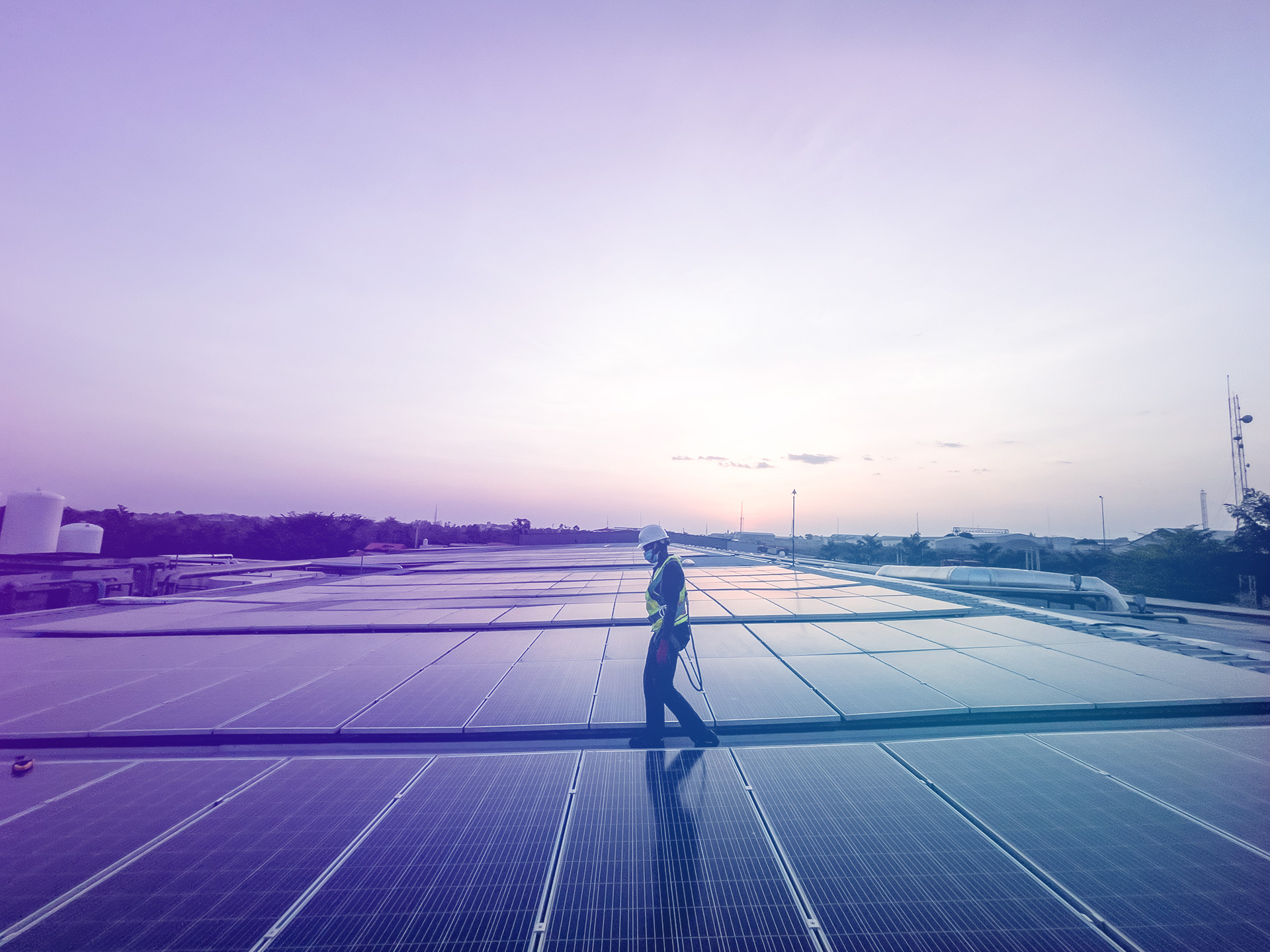
To complement the blues, we added lush hues of purple, pinks, and orange. We wanted to evoke sunrise and sunset, which alight the sky with luscious pastel colors.
Photographers refer to the early morning and evening, right when the sun hovers low in the horizon, as “golden hour.” Not only do you capture the best images, but you can feel the promise of a new day.
That’s what drives us everyday.
Our look has changed, but our mission hasn’t.
By providing clean and affordable energy, we want to help African businesses grow and in turn create jobs and drive greater prosperity.
Go to our new website to learn more.